The Firm branding Preview panel shows 'Primary button' and 'Secondary button' samples. These represent the color scheme of the call-to-action buttons your clients see in the portal.
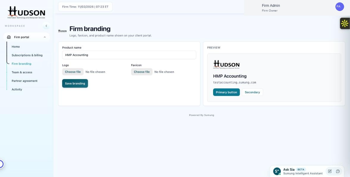
Primary and secondary button styles in the Firm branding Preview panel
What You Can Do
- Navigate to Firm branding.
- In the Preview panel on the right, look at the two sample buttons: 'Primary button' (teal/dark) and 'Secondary button' (outlined).
- These buttons use the platform's default color palette which is part of the Sumung theme.
- For custom button colors, enterprise-level customization options may be available — contact Sumung support.
- The Preview is read-only for button colors — it reflects the theme, not a setting you can change here.
💡 Good to Know: The current default theme uses a teal primary color and a light secondary style.
💡 Good to Know: Custom color themes for the client portal may be available in future product updates.
Related Articles
Was this article helpful?
Your feedback helps us improve our documentation.